Cart Button
The Cart Button feature allows you to display a button inside the slide cart that redirects users to the full cart page.
This provides an alternative navigation option in addition to the checkout button.
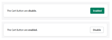
Feature Status
At the top of the section:
- Enabled → The cart button is visible in the slide cart
- Disabled → The cart button is hidden
Use the toggle button to activate or deactivate this feature.
Cart Button Settings
This section allows you to customize the appearance and behavior of the Cart Button displayed inside the slide cart.
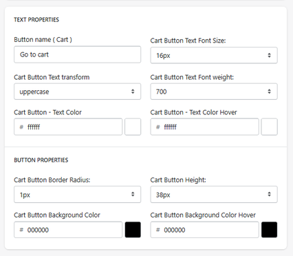
Text Properties
Button Name
Defines the label displayed on the cart button.
- Example: Go to cart
Text Font Size
Defines the size of the button text.
- Example: 16px
Text Transform
Controls the formatting of the text.
- Example: uppercase
Font Weight
Defines the thickness of the text.
- Example: 700 (bold)
Text Color
Defines the default color of the button text.
Text Color (Hover)
Defines the color of the text when hovering over the button.
Button Properties
Border Radius
Controls how rounded the button corners are.
- Example: 1px
Button Height
Defines the height of the button.
- Example: 38px
Background Color
Defines the default background color of the button.
Background Color (Hover)
Defines the background color when hovering over the button.
How It Works
The Cart Button styling settings allow you to:
- Match the button design with your store branding
- Ensure visual consistency with the checkout button
- Improve visibility and usability of the cart navigation
Summary
The Cart Button Settings allow you to:
- Customize text, colors, and typography
- Control button size and shape
- Define hover interactions
These settings help create a consistent and user-friendly cart experience while guiding users toward reviewing their cart before checkout.

