Slide Cart Design
The Slide Cart Design section allows you to configure the overall layout, position, animation, and behavior of the slide cart.
This is where you define how the cart looks and how it appears to users.
Design Style
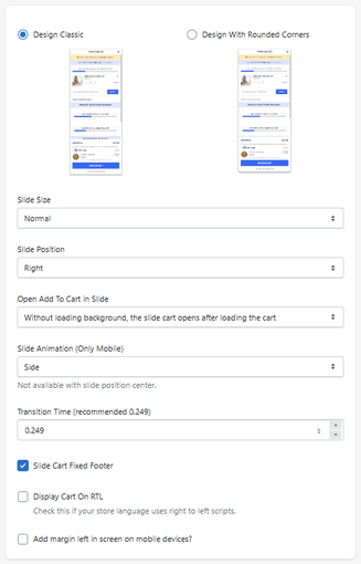
Design Classic
Displays the cart with a standard rectangular layout.
Design With Rounded Corners
Applies rounded edges for a softer, modern appearance.
Layout Settings
Slide Size
Defines the width of the slide cart.
- Example: Normal
Slide Position
Defines where the cart appears on the screen.
- Right → slides from the right side
- (Other options may be available depending on setup)
Cart Behavior
Open Add To Cart In Slide
Defines how the cart behaves when a product is added.
-
Example:
Without loading background → opens after cart updates
Slide Animation (Mobile Only)
Defines how the cart animates on mobile devices.
- Example: Side
Not available when position is set to center
Transition Time
Defines how fast the animation occurs.
- Recommended: 0.249 seconds
Additional Options
Slide Cart Fixed Footer
Keeps the footer (checkout area) fixed and always visible.
Display Cart on RTL
Enables right-to-left layout for languages like Arabic or Hebrew.
Add Margin on Mobile
Adds spacing on the left side for mobile devices.
How It Works
This section controls:
- Visual style (classic vs rounded)
- Position and size
- Animation behavior
- Interaction when adding products
All changes directly impact how users experience the cart.
Summary
The Slide Cart Design section allows you to:
- Customize the cart’s visual style
- Control positioning and size
- Define animation and behavior
- Optimize UX across devices
It is the foundation of the cart experience and directly impacts usability and conversion.
