Slide Cart Header Properties
The Slide Cart Header Properties section allows you to customize the appearance and structure of the cart header.
This includes styling for the header background, title, and close button.
Tabs Overview
This section is divided into three configuration tabs:
- General → overall header layout and background
- Title → header text styling
- Close Button → close icon customization
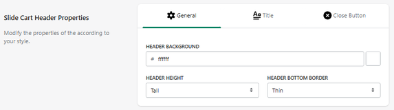
General Settings
Header Background
Defines the background color of the cart header.
- Example: #ffffff
Header Height
Controls the vertical size of the header.
- Example: Tall
Header Bottom Border
Defines the border style at the bottom of the header.
- Example: Thin
How It Works
These settings control the visual structure of the top section of the cart:
- The header remains visible at all times
- It contains the title and close button
- Styling changes affect overall cart appearance
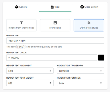
Header Title Settings
The Title tab allows you to customize the content and styling of the cart header title.
This is the main text displayed at the top of the slide cart.
Title Display Options
You can choose how the header title is defined:
Inherit from Theme Titles
Uses the default title styling from your store theme.
Brand Logo
Displays your store logo instead of text.
Define Text Styles
Allows full customization of the header text (selected option).
Header Text
Header Text
Defines the text displayed in the cart header.
-
Example:
Your Cart - {qty}
{qty}dynamically displays the number of items in the cart.
Text Styling
Header Text Color
Defines the color of the title.
- Example: #000000
Header Text Alignment
Controls text alignment.
- Example: Side
Header Text Transform
Controls text formatting.
- Example: capitalize
Header Text Font Weight
Defines text thickness.
- Example: 600
Header Text Font Size
Defines the size of the title.
- Example: 24px
How It Works
- The title updates dynamically based on cart content
-
{qty}ensures real-time item count display - Styling changes apply instantly to the header
Header Close Button Settings
The Close Button tab allows you to customize the appearance and position of the button used to close the slide cart.
This button is a key interaction element for user navigation.
Position
Header Icon Position
Defines where the close button appears in the header.
- Example: Right
Background Styling
Icon Background Color
Defines the default background color of the close button.
- Example: #0000000c (light transparent)
Icon Background Color (Hover)
Defines the background color when hovering.
- Example: #00000014
Icon Settings
Icon Size
Controls the size of the close icon.
- Example: 8px
Icon Thickness
Defines the thickness of the icon lines.
- Example: Normal
Icon Color
Defines the default color of the icon.
- Example: #637381
Icon Color (Hover)
Defines the color when hovering.
Button Border
Border Style
Defines the border style of the close button.
- Example: Normal
Border Color
Defines the default border color.
- Example: #ff636300
Border Color (Hover)
Defines the border color when hovering.
How It Works
- The close button remains visible in the header
- It allows users to quickly exit the cart
- Hover effects improve visual feedback
Summary
The Slide Cart Header Properties section allows you to:
- Customize header background and size
- Define border styling
- Control the visual structure of the cart header
It is a key area for branding and first visual impact within the cart.


