Product Listing – Appearance Customization
The Product Listing section allows you to configure the visual layout and interaction style of product cards displayed within filtered search results and collection pages.
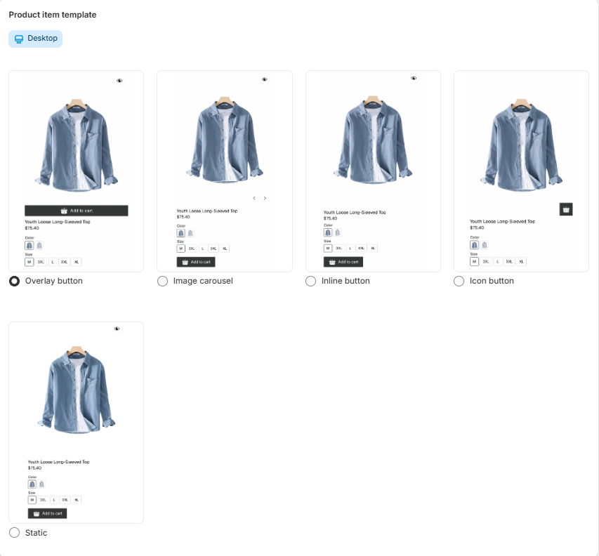
Product Item Template (Desktop)
Under Product item template, you can select how each product card behaves and displays interactive elements.
The available layout options are presented as selectable templates.
Available Display Modes
1. Overlay Button
Displays action buttons (such as Add to Cart or Quick View) as an overlay that appears on top of the product image when hovered.
Best for:
Modern, minimal product grids
Stores prioritizing clean layouts with hover interactions
2. Image Carousel
Enables a carousel effect within the product image area, allowing customers to browse multiple product images directly from the collection grid.
Best for:
Products with multiple images
Enhancing visual engagement without leaving the collection page
3. Inline Button
Displays action buttons directly below the product details (title, price, variants).
Best for:
Clear and accessible purchase actions
Stores prioritizing direct add-to-cart functionality
4. Icon Button
Shows compact icon-based action buttons instead of full-width buttons.
Best for:
Minimalist design systems
Grid layouts with limited space
5. Static
Displays product cards without interactive hover effects or dynamic elements.
Best for:
Simple layouts
Performance-focused implementations
Stores that prefer standard Shopify theme behavior
. How to Select a Template
Select the desired layout using the corresponding radio button.
The selected template will apply to product listings on desktop.
Changes update the appearance of products within filtered results and collection views.
. Purpose and Benefits
-
Align product grid design with your brand identity.
-
The selected template will apply to product listings on desktop.
Changes update the appearance of products within filtered results and collection views.
Product Listing – General Settings
The General Settings section allows you to control the behavior and display logic of product cards within filtered results and collection pages.
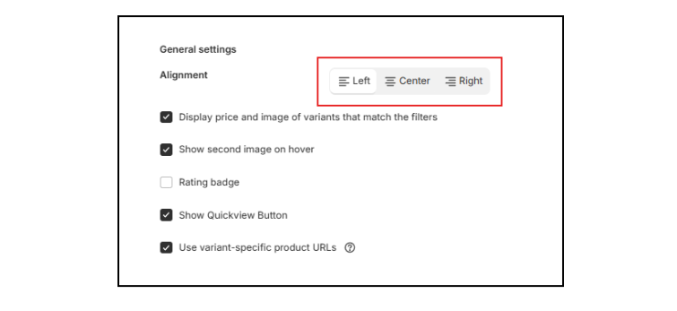
Alignment
Controls the horizontal alignment of product card content.
Available options:
-
Left – Aligns product information to the left.
-
Center – Centers product information within the card.
-
Right – Aligns product information to the right.
This setting affects the layout of titles, prices, variant selectors, and action buttons.
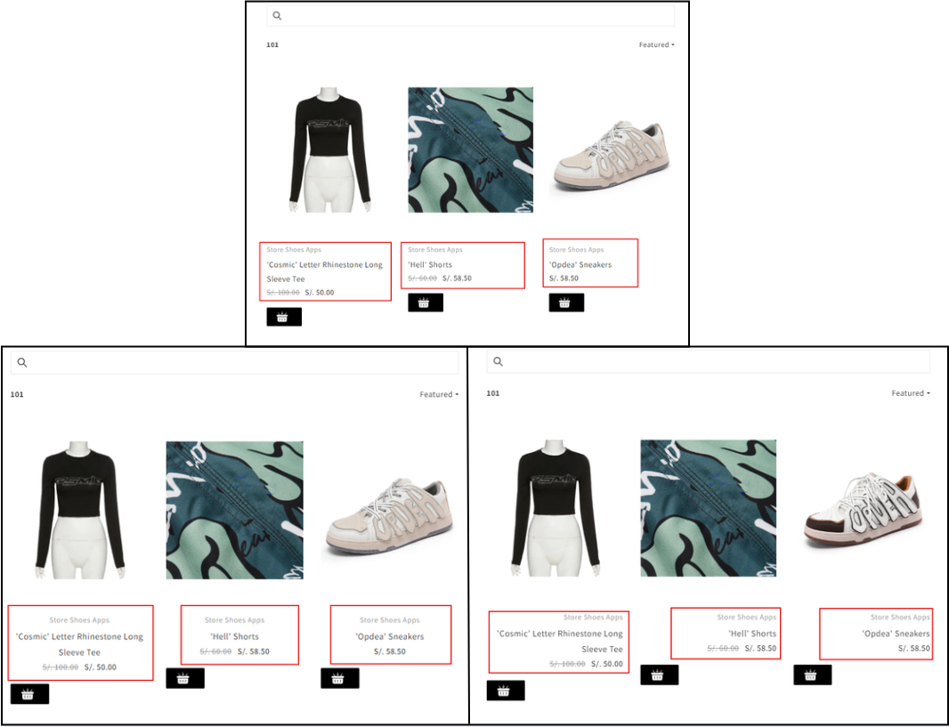
Display Price and Image of Matching Variants
When enabled:
-
The product card dynamically updates to show the price and image of the specific variant that matches the selected filters.
-
Improves accuracy and clarity when filtering by variant-based attributes (e.g., color, size).
When disabled:
-
The default product image and base price will be displayed.
Recommended for stores using variant-based filtering.
Rating Badge
When enabled:
Displays a product rating badge on the product card.
Requires compatibility with a supported review app.
Useful for:
Increasing trust and social proof.
Highlighting highly rated products.
Show Quickview Button
When enabled:
Displays a Quick View button on the product card.
Allows customers to preview product details in a modal without navigating away from the collection page.
Benefits:
Faster browsing experience.
Reduced page reloads.
Improved conversion flow.
Use Variant-Specific Product URLs
When enabled:
Generates unique URLs for specific product variants.
Ensures that when a customer clicks a filtered result, the selected variant is preloaded on the product page.
Benefits:
Improved user experience.
Better tracking and deep linking.
More accurate navigation from filtered results.
Functional Impact
These settings allow you to:
-
Improve filter accuracy at the variant level.
-
Enhance browsing experience.
Increase engagement with interactive elements.
Optimize product discovery and conversion flow.
Product Grid Configuration
The Product Grid section allows you to control the number of products displayed per row across different screen sizes.
This responsive configuration ensures that your product listings remain optimized for desktop, tablet, and mobile devices.
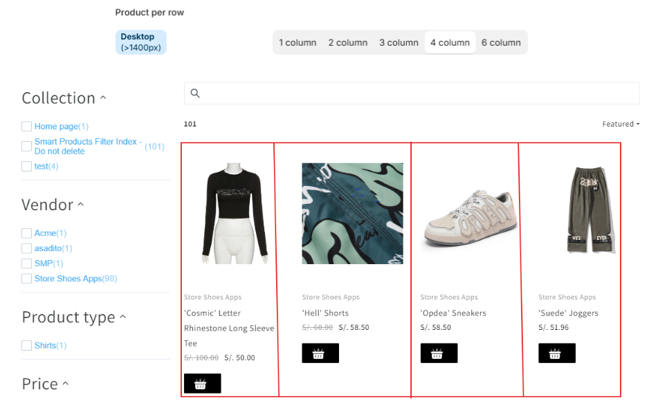
Products per Row
You can define the number of columns independently for each device breakpoint.
Each setting applies automatically based on the customer’s screen width.
Desktop (> 1400px)
Applies to large desktop screens wider than 1400 pixels.
Available options:
-
1 column
-
2 columns
-
3 columns
-
4 columns
-
6 columns
Use higher column counts (e.g., 4 or 6) for wide layouts that maximize product visibility.
-
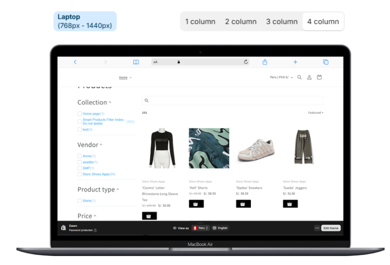
Laptop (768px – 1440px)
Applies to standard desktop and laptop screens between 768px and 1440px.
Available options:
1 column
2 columns
3 columns
4 columns
This range typically represents the majority of desktop users.
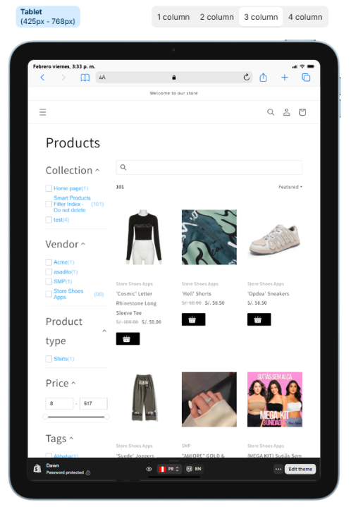
Tablet (425px – 768px)
Applies to tablet-sized devices.
Available options:
1 column
2 columns
3 columns
4 columns
Two columns are commonly recommended for maintaining readability while maximizing product exposure.
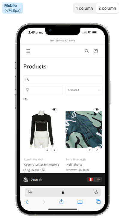
Mobile (< 768px)
Applies to smartphones and small-screen devices.
Available options:
1 column
2 columns
One column provides larger product images and improved touch interaction. Two columns increase product density while maintaining usability.
Responsive Behavior
The grid automatically adapts based on screen size, ensuring
Consistent product presentation across devices
Improved user experience
Optimized browsing and conversion performance
Better visual balance between product density and readability
Best Practice Recommendations
Use 4–6 columns for large desktop screens to maximize visibility.
Use 3–4 columns for laptops to maintain clarity.
Use 2 columns for tablets.
Use 1–2 columns for mobile, depending on your design preference.
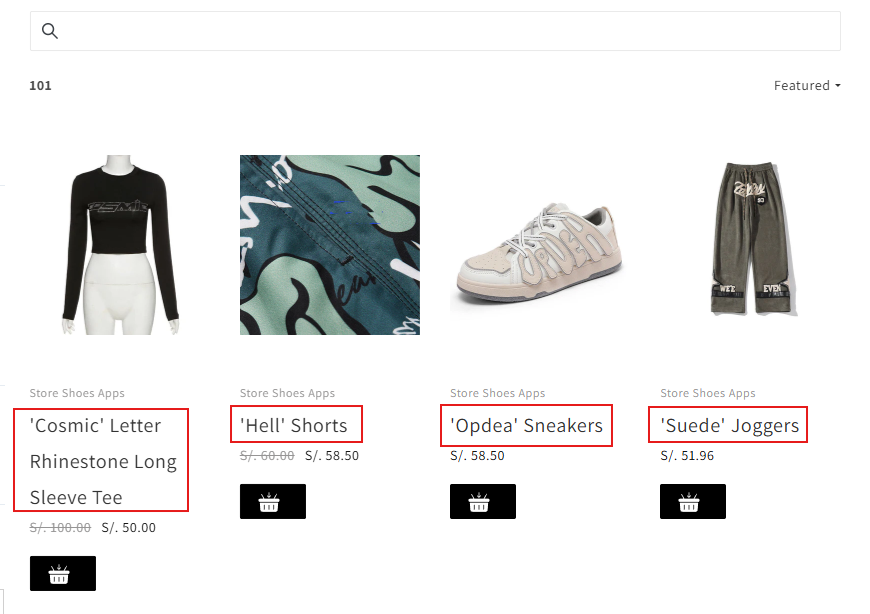
Product Title Settings
The Product Title section allows you to customize the typography and interactive styling of product names displayed within the product grid.
These settings apply to product titles shown in filtered results and collection listings.
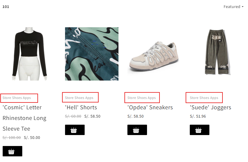
Product Vendor Settings
The Product Vendor section allows you to enable and customize the display of the vendor (brand) name within product cards in the product grid.
These settings apply to filtered results and collection listings.
Enable / Disable Vendor Display
The toggle switch at the top of the section controls whether the vendor name is displayed on product cards.
-
On – The vendor name will be visible.
-
Off – The vendor name will be hidden.
This setting allows you to decide
-
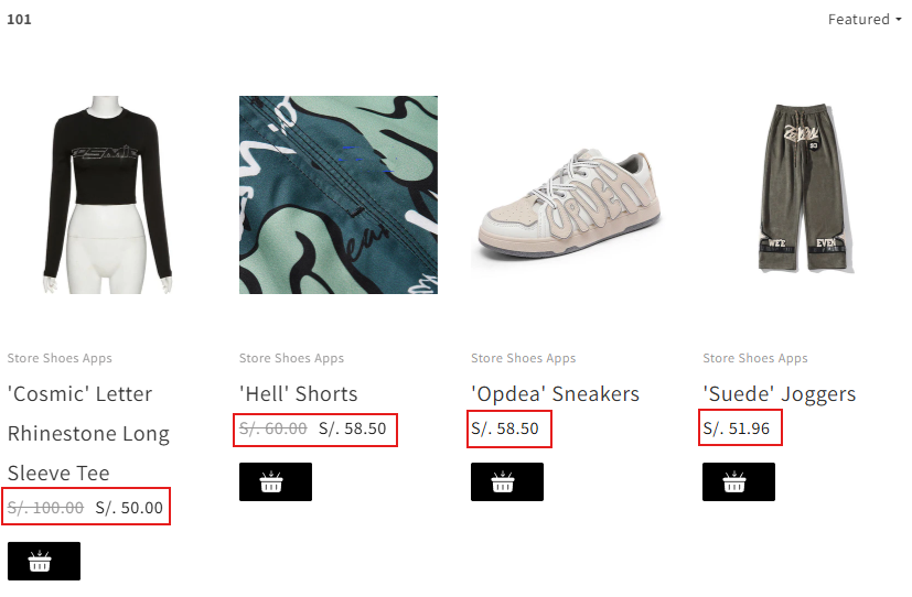
Product Price Settings
The Product Price section allows you to enable and customize the visual appearance of pricing information displayed within product cards. These settings apply to filtered results and collection pages.
Enable / Disable Price Display
The toggle switch at the top of the section controls whether product prices are displayed in the product grid.
-
On – The product price will be visible.
-
Off – The product price will be hidden.
This allows you to control whether pricing is part of your listing presentation.
-
Add to Cart Button Settings
The Add to Cart Button section allows you to enable and fully customize the appearance of the add-to-cart button displayed within product cards.
These settings apply to product listings in filtered results and collection pages.
Enable / Disable Add to Cart Button
The toggle switch at the top of the section controls whether the Add to Cart button is displayed in the product grid.
-
On – The button will be visible on product cards.
-
Off – The button will be hidden.
Enabling this feature allows customers to add products directly from the listing page without visiting the product detail page.
-
Sold Out Label Settings
The Sold Out Label section allows you to enable and customize the appearance of the label displayed on products that are out of stock.
These settings apply to product cards shown in filtered results and collection pages.
Enable / Disable Sold Out Label
The toggle switch at the top of the section controls whether the Sold Out label is displayed on unavailable products.
-
On – The label will appear on products that are out of stock.
-
Off – No label will be displayed for sold-out products.
Enabling this feature helps customers quickly identify unavailable items.
-
Sale Label Settings
The Sale Label section allows you to enable and customize the appearance and content of the label displayed on discounted products.
These settings apply to product cards shown in filtered results and collection pages.
Enable / Disable Sale Label
The toggle switch at the top of the section controls whether the Sale label is displayed on products with a reduced price.
-
On – The label will appear on discounted products.
-
Off – No label will be displayed for sale items.
Enabling this feature helps highlight promotional products and attract customer attention.
-
Swatches Settings
The Swatches section allows you to enable and configure variant swatches displayed within product cards in the product grid.
Swatches provide a visual representation of product variants (such as color, pattern, or material), allowing customers to preview options directly from collection or filtered result pages.
Enable / Disable Swatches
The toggle switch at the top of the section controls whether swatches are displayed on product cards.
-
On – Variant swatches will be visible.
-
Off – Swatches will not be displayed.
Enabling swatches enhances visual browsing and improves variant selection clarity.
-
Style
Defines the shape of the swatches displayed on product cards.
Available options:
-
Squares – Displays swatches in a square shape.
-
Circle – Displays swatches in a circular shape.
The selected style applies consistently across all product listings.
-
Options Configuration
The Options table allows you to configure which product options will display as swatches.
Columns include:
-
Options – The product option name (e.g., Color, Material).
-
Display Type – Defines how the swatch will be rendered (e.g., color-based, image-based, or text-based, depending on configuration).
-
Add Swatch Option
Click Add swatch option to:
-
Create a new swatch configuration.
-
Assign a product option (such as Color) to display as a swatch.
-
Define its display behavior.
-


