The Filters section allows you to create, manage, and organize filter configurations applied to your store collections.
Each filter configuration defines how filtering behaves across specific collections.
Navigation Path
Filters Dashboard → Filters
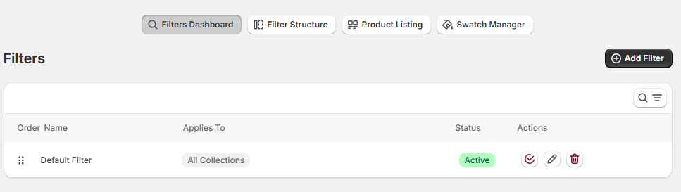
Filters Overview Page
This page displays a list of all filter configurations currently created in your store.
Each row represents a filter configuration group.
Table Columns
The filters table includes the following columns:
1. Order
A drag-and-drop handle appears at the beginning of each row.
-
Allows you to reorder filter configurations.
-
Determines priority when multiple filter sets apply.
-
Drag the icon to adjust order.
2. Name
Displays the internal name of the filter configuration.
Examples:
-
Default Filter
-
test atf
This name is used for administrative identification and does not appear on the storefront.
3. Applies To
Indicates which collections the filter configuration is assigned to.
Example:
-
All Collections
This means the filter structure is active across the entire store.
If specific collections are assigned, they will be listed here instead.
4. Status
Indicates whether the filter configuration is currently active.
-
Active – The filter configuration is applied to assigned collections.
-
Inactive (if available) – The configuration is disabled.
Only active filters affect the storefront.
5. Actions
Each filter configuration includes action icons:
✔ Activate / Status Toggle
Confirms or changes activation status.
✏ Edit
Opens the filter configuration for editing.
🗑 Delete
Removes the filter configuration permanently.
Deleting a filter will immediately remove it from assigned collections.
Add Filter
Located at the top-right corner of the page.
Click Add Filter to:
-
Create a new filter configuration.
-
Assign collections.
-
Define filter structure.
-
Configure display types.
-
Set sorting and behavior.
Search & Filter Controls (Top Right)
The page also includes interface controls such as:
-
Search icon – To quickly locate filter configurations.
-
View or sorting controls (if enabled).
How Filter Configurations Work
Each filter configuration:
-
Defines a group of filter options.
-
Can be assigned to specific collections.
-
Controls the filtering experience on the storefront.
-
Works independently from other configurations.
If multiple configurations exist, the system applies the one matching the collection context.
Best Practices
-
Use a single default filter for global consistency.
-
Create specialized filters for unique collections.
-
Avoid overlapping filter assignments.
-
Regularly review filter status.
-
Use descriptive internal names for clarity.
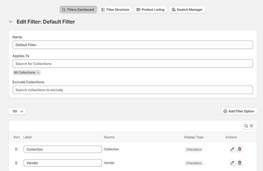
Edit Filter Configuration
Navigation Path
Filters → Select Filter → Edit
The Edit Filter page allows you to configure a filter structure assigned to specific collections.
In this example, we are editing the Default Filter, which applies globally.
1. General Settings
At the top of the page, you will configure the filter’s scope and identification.
Name
Defines the internal name of the filter configuration.
-
Used for administrative reference.
-
Not visible on the storefront.
-
Recommended to use descriptive naming (e.g., “Default Filter”, “Shoes Collection Filter”).
Applies To
Determines which collections will use this filter configuration.
-
Use the search field to find collections.
-
Selecting All Collections applies this configuration globally.
-
You may assign multiple specific collections instead.
Exclude Collections
Allows you to exclude specific collections from this filter configuration.
Use this when:
-
You want global filters except for specific categories.
-
A particular collection requires a custom filter structure.
2. Filter Options Table
Below the general configuration, you will see the filter structure table.
Each row represents one filter option visible on the storefront.
Table Columns Explained
Sort (Drag Handle)
-
Drag and drop to change the order.
-
Controls how filters appear to customers.
-
Higher position = displayed first.
Label
The visible name of the filter on the storefront.
Examples:
-
Collection
-
Vendor
-
Product type
-
Price
-
Tags
-
Availability
-
Color
You may edit this label for customization.
Source
Indicates where the filter data originates from Shopify.
Common sources include:
-
Collection
-
Vendor
-
Product Type
-
Price
-
Tags
-
Category
-
Availability
-
Product Options (e.g., Size, Color)
The source determines which product data field powers the filter.
Display Type
Defines how the filter appears to customers.
Common display types:
Checkbox – Allows multiple selections within the same filter.
Radio – Allows only one selection at a time.
Swatch – Displays options as visual color or image swatches.
Swatch Text – Displays stylized text-based selectable options.
Box Rectangle – Shows options inside rectangular clickable boxes.
Select – Displays options inside a dropdown menu.
Range Slider – Used for numeric ranges (e.g., Price).
Collection – Filters products based on assigned Shopify collections.
Actions
Each filter option includes action icons:
✏ Edit
-
Modify label, display type, or configuration.
🗑 Delete
-
Remove the filter option from this configuration.
3. Add Filter Option
Located at the top-right of the table.
Click Add Filter Option to:
-
Create a new filter.
-
Select its source.
-
Define display type.
-
Configure label and behavior.
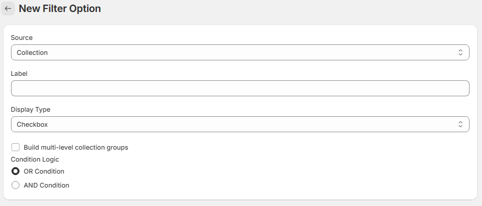
New Filter Option
Navigation Path
Filters → Edit Filter → Add Filter Option
The New Filter Option page allows you to create a new filter within a filter configuration.
Each filter option defines:
-
The data source
-
The display type
-
The label shown on the storefront
-
The filtering logic behavior
1. Source
Defines the Shopify data field used to generate the filter values.
Examples of sources may include:
Standard
Collection
-
Price
-
Vendor
-
Product Type
-
Tags
-
Category
-
Availability
-
Ready to ship
-
Location
3 unidades
-
color
-
color name
-
colour
-
farbe
-
frame color
-
kid size
-
length (cm)
-
main stone color
-
metal color
-
model
-
net weight
-
pants size
-
power
-
purity
-
size
-
specification
-
style
-
tamanho
The selected source determines which product attribute powers the filter.
2. Label
Defines the name displayed to customers on the storefront.
-
This is fully customizable.
-
Does not need to match the Shopify attribute name.
-
Recommended to use clear and customer-friendly wording.
Example:
-
Instead of “Product Type”, you may use “Category”.
-
Instead of “Vendor”, you may use “Brand”.
3. Display Type
Defines how the filter appears to customers.
Common display types:
Checkbox – Allows multiple selections.
Radio – Allows only one selection at a time.
Swatch – Displays visual color or image swatches.
Swatch Text – Displays stylized text-based options.
Box Rectangle – Shows options inside rectangular clickable boxes.
Select – Displays options inside a dropdown menu.
Range Slider – Used for numeric ranges (e.g., Price).
Collection – Filters products based on Shopify collections.
Choosing the correct display type improves usability and conversion performance.
4. Build Multi-Level Collection Groups
When enabled, this option allows collections to be structured hierarchically.
Use this when:
-
You want parent and child collections.
-
You want nested category filtering.
-
Your store has structured category trees.
Example:
-
Clothing
→ Men
→ Women
This improves large catalog navigation.
5. Condition Logic
Determines how multiple selections within the same filter behave.
OR Condition (Default)
Products match if they meet any selected values.
Example:
If a customer selects:
-
Red
-
Blue
Results will include products that are Red OR Blue.
Filter Values Configuration
This section defines which values will be available in the filter and how they will be ordered on the storefront.
1. Values
Determines which filter values will be displayed to customers.
Use all values
When selected:
-
All available values from the selected source will be displayed automatically.
-
Values are dynamically generated from product data.
-
Recommended for most standard filters (Vendor, Tags, Product Type, etc.).
This option ensures the filter stays updated when new products or attributes are added.
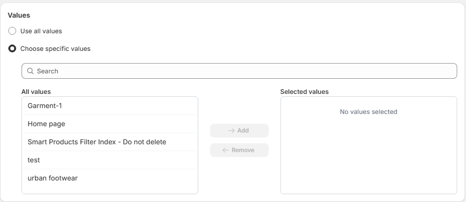
Choose specific values
When Choose specific values is selected, the filter will only display the values you manually select.
This option provides full control over which filter options are visible to customers.
How It Works
Once enabled, the interface displays:
-
A Search field
-
An All values list
-
A Selected values list
-
Add and Remove controls
Search Field
Located at the top of the section.
-
Allows you to quickly find values.
-
Useful for large catalogs with many options.
-
Filters the “All values” list dynamically.
All Values
This panel shows every available value from the selected source.
Example values shown in the screenshot:
-
Garment-1
-
Home page
-
Smart Products Filter Index – Do not delete
-
test
-
urban footwear
These values are pulled directly from the selected filter source (e.g., Collections).
Selected Values
This panel displays the values that will appear on the storefront.
Initially:
-
“No values selected” is displayed.
To add a value:
-
Select it from the All values list.
-
Click Add.
-
The value moves to Selected values.
To remove a value:
-
Select it in the Selected values panel.
-
Click Remove.
Only values in the Selected values list will be visible to customers.
When to Use “Choose Specific Values”
Recommended for:
-
Highlighting specific brands.
-
Promoting selected collections.
-
Hiding internal or system collections.
-
Removing low-performing options.
-
Simplifying filters in large catalogs.
-
Curating premium product categories.
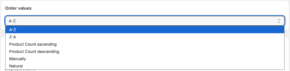
2. Order Values
Determines how filter values are sorted on the storefront.
Available sorting options:
A–Z
Sorts values alphabetically in ascending order.
Example:
Blue → Green → Red
Z–A
Sorts values alphabetically in descending order.
Example:
Red → Green → Blue
Product Count Ascending
Sorts values by the number of matching products (lowest first).
Example:
Color with 2 products → Color with 50 products
Product Count Descending
Sorts values by the number of matching products (highest first).
Example:
Color with 50 products → Color with 2 products
This is useful to highlight popular filter options.
Manually
Allows you to manually define the order of values.
-
Drag and drop values into preferred order.
-
Best for merchandising control.
-
Recommended for size filters (XS → S → M → L
Natural
Uses the system’s original data order.
-
Maintains Shopify’s internal attribute order.
-
Commonly used for numeric or structured values.
Choosing the Right Sorting Strategy
-
Use A–Z for brands and text attributes.
-
Use Product Count Descending to emphasize popular options.
-
Use Manually for sizes or structured variant data.
-
Use Natural when numeric ordering matters (e.g., dimensions).
Storefront Impact
Value ordering directly affects:
-
User navigation flow
-
Filter usability
-
Perceived popularity of options
-
Conversion optimization
-
Merchandising strategy
A well-ordered filter improves scanning efficiency and reduces decision fatigue.
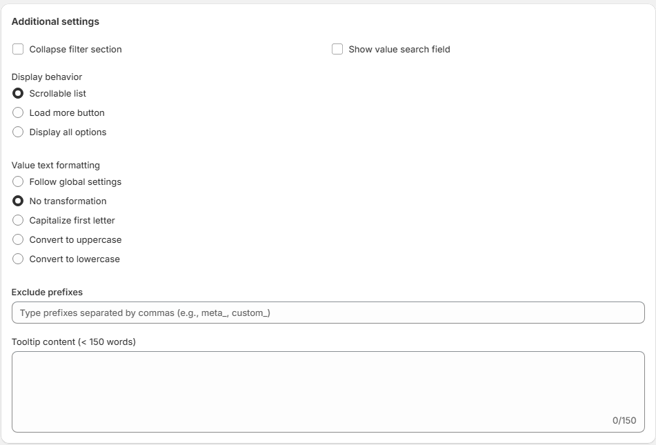
Additional Settings
The Additional Settings section provides advanced customization options for how the filter behaves and appears on the storefront.
These settings allow you to refine usability, layout, formatting, and data handling.
1. Collapse Filter Section
When enabled:
-
The filter section will appear collapsed by default.
-
Customers must click to expand it.
Recommended for:
-
Large filter lists
-
Mobile optimization
-
Reducing visual clutter
2. Show Value Search Field
When enabled:
-
A search input appears inside the filter.
-
Customers can search within filter values.
Recommended for:
-
Filters with many values (e.g., Brand, Tags, Collections)
-
Large catalogs
3. Display Behavior
Defines how filter values are displayed when the list is long.
Scrollable List
Displays values inside a scrollable container.
-
Keeps layout compact.
-
Suitable for sidebars.
Load More Button
Shows a limited number of values initially.
-
Additional values appear when clicking “Load More”.
-
Improves performance and readability.
Display All Options
Displays all filter values at once.
-
No scrolling or expansion.
-
Best for short value lists.
4. Value Text Formatting
Controls how filter values are formatted visually.
Follow Global Settings
Uses the global text formatting defined in the app.
No Transformation
Displays values exactly as stored in Shopify.
Capitalize First Letter
Convert to Uppercase
Convert to Lowercase
Recommended to maintain consistency with your store’s design system.5. Exclude Prefixes
Allows you to remove unwanted prefixes from filter values.
Example input: meta_, custom_
If a value is: meta_color
It will display as: color
Recommended for:
Shopify metafields
Technical tag prefixes
Cleaning internal data labels
6. Tooltip Content (Maximum 150 Words)
Allows you to add an informational tooltip to the filter.
Appears when customers hover over or interact with the filter label.
Used to provide guidance or explanations.
Example uses:
Size guide information
Material explanation
Shipping availability clarification
Filtering instructions
Limit: 150 words.
Storefront Impact
These settings affect:
Filter visibility
UX clarity
Mobile experience
Catalog readability
Data cleanliness
Conversion performance
Best Practices
Use collapsible filters for mobile-first stores.
Enable value search for filters with 20+ values.
Use scrollable behavior for long lists.
Standardize text formatting across all filters.
Clean technical prefixes to improve professionalism.
Use tooltips for educational filters (Size, Material, Shipping).